In this article, I want to talk about the software that makes Motorola phones so desirable, among other things. Motorola calls its software MyUX, and it is a software interface that uses Stock Android at its core while providing a clean and fast experience for consumers. Let us discuss why MyUX might be the best clean version of Android and how it competes with other Android competitors, including Google’s own Pixel UI.
What Is MyUX by Motorola?
MyUX is the software interface Motorola uses on all its smartphones and tablets. It is based on the Android operating system and includes all the latest Android features with some additional useful options added specifically for Motorola devices. MyUX is a clean and highly optimized version of vanilla Android. The latest version of MyUX is MyUX 4.0 at the time of writing. It is based on Android 13 and is available for almost all Motorola devices released in the last 1 year.
What Makes MyUX Special?
There are a few features that distinguish MyUX from other Android skins. We have listed all the unique aspects of MyUX in the list below to make it easier.
The Clock Widget
The first thing you see after setting up your Motorola device is the home screen, and by default, there is a minimal clock widget there. This is an interactive widget that displays the current time, date, and weather information. But this widget has a few more pages when you swipe up and down, where it shows your alarms and the settings for the widget. Personally, I like to keep this widget on my home screen because it is very informative compared to the normal clock widget from Google.
The Themes
Motorola has implemented Material U in MyUX, and thus you get a complete menu for customizing the background image, font, accent colors, etc. You can access this menu by long-pressing on the home screen or via the Moto app.
The Moto App
The Moto app is probably the most interesting part of MyUX, as it contains all the customization options available for Motorola devices. There are tons of options, such as changing the look of UI or adding useful features. The gestures like turning on the flashlight with a double chopping gesture, holding three fingers on the screen to take a screenshot, double twisting to turn on the camera, etc.
Apart from the above features, Moto has also added things like Ready For and Dolby Atmos, but these are only available for higher-end devices, so we have not mentioned them in the list above. All of this combined makes using a Motorola device a much more enjoyable and richer experience compared to other manufacturers.
Difference Between MyUX and Pixel UI
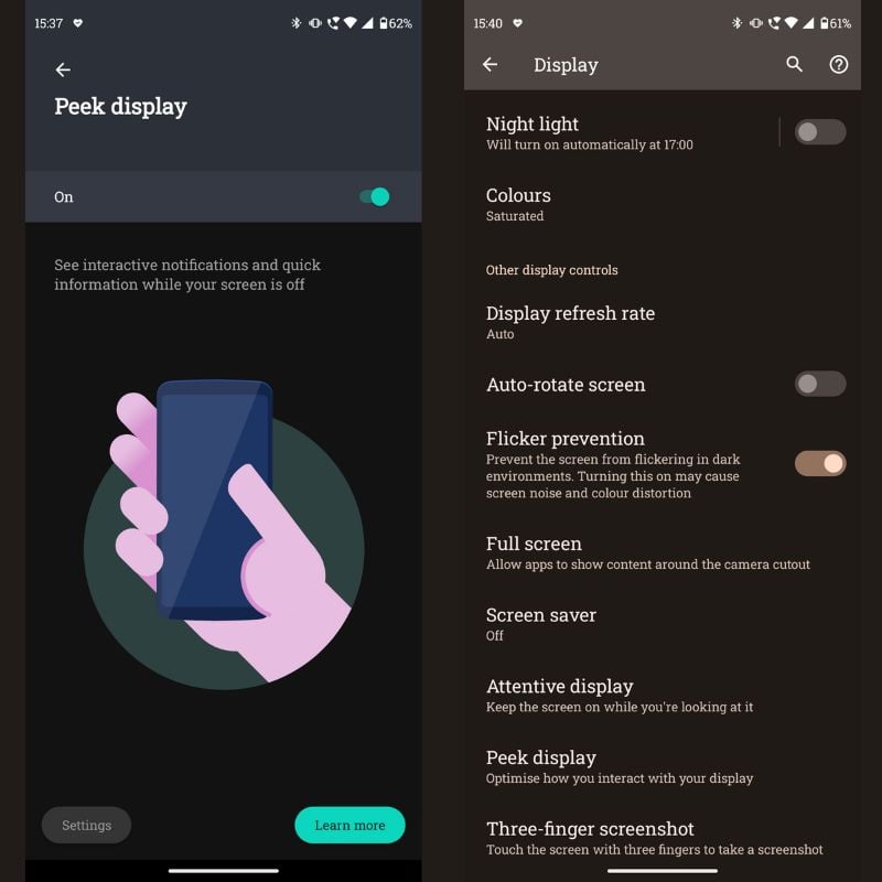
While Pixel UI focuses mainly on features that rely heavily on AI and computation, MyUX brings in useful features that users can use in their daily lives. Pixel UI has smart features such as live transcription, excellent speech-to-text conversion, call screening by Google Assistant, and many more features that help users achieve more with their smartphones. MyUX offers the ability to customize UI with built-in style options and a variety of gestures to make things easier to access. The Moto Peek Display is considered one of the best implementations of an AOD (Always On Display) because it displays all the information you need without having to wake up the smartphone, and it also allows you to interact with that information directly from the Peek Display, unlike traditional always-on displays.
In terms of camera optimization, the Pixel UI, with its computer-aided photography and processing, is clearly better than the implementation Motorola did in its camera app.
Is MyUX the Best Experience on Android?
MyUX has many features that are actually useful in our daily lives, not just for show. Motorola has gone a long way in implementing features like the gestures to turn on the flashlight and camera, the peek display, the anti-flicker mode for high refresh rate displays, etc. Although Moto is lagging behind in providing timely software updates, it offers absolutely stable updates with very few or no bugs. This results in Moto devices lasting longer compared to other manufacturers. Some users may like the feature-rich UI of the Chinese OEMs, but all those features take time to be implemented on newer hardware and newer Android versions. This usually leads to delayed updates and faulty devices that are littered with bugs. For this reason, MyUX is my favorite skin on Android as it offers a clean and minimal experience coupled with useful features that I actually enjoy using in my daily life. What are your thoughts on MyUX? What is your favorite Android UI? Let us know in the comments below.


![]()

